Wordmark logo for a consultancy
A wordmark-led logo for a consultancy that needed to look established from the first meeting — restrained, confident and legible anywhere.
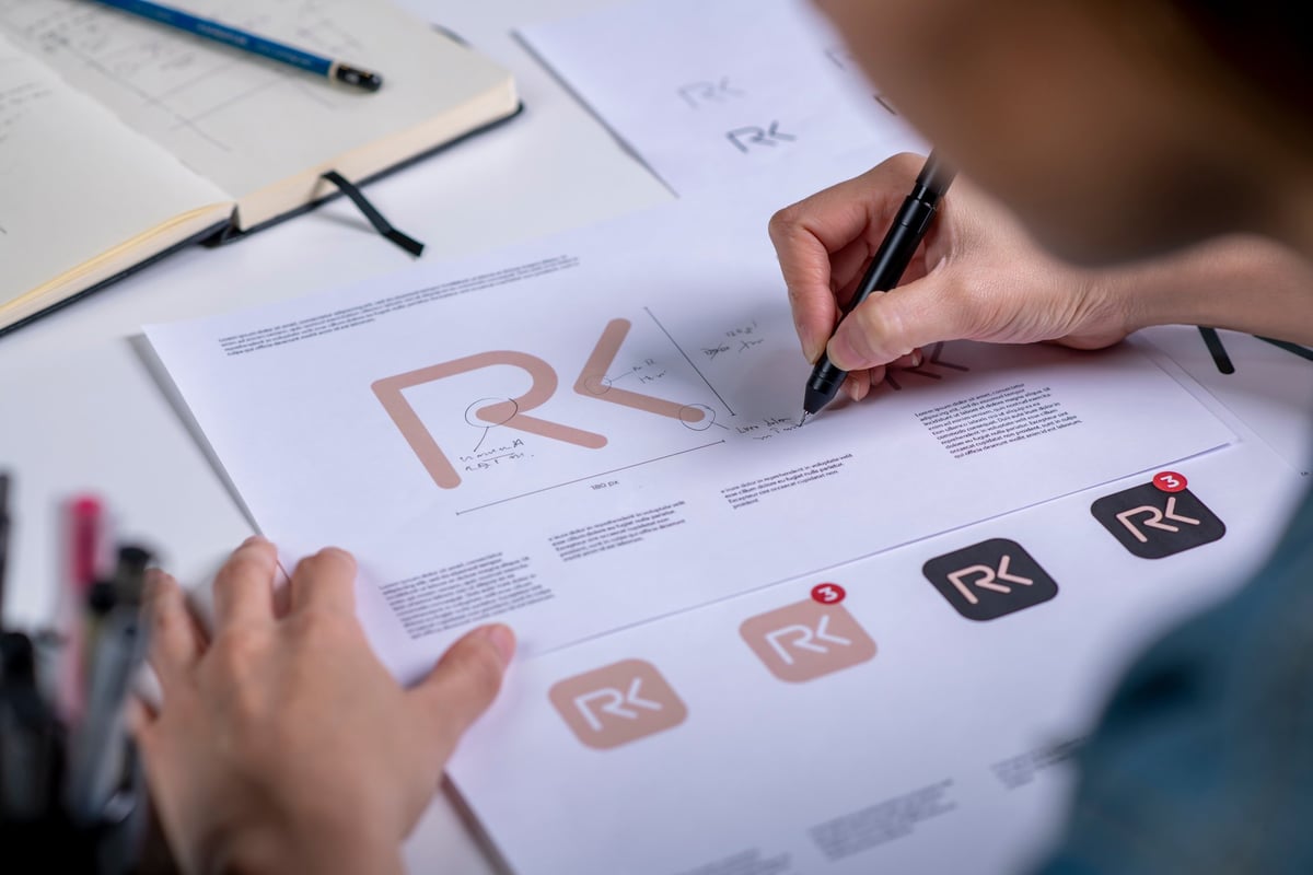
Looking credible before the conversation starts
A consultancy pitching for work against firms with decades of history. Their expertise was never in question, but their logo was — an improvised mark that quietly undermined them in every proposal and pitch deck.
They wanted something restrained rather than loud. Not a colourful brand, but a mark that felt considered and dependable — the kind a client trusts with a serious decision.
At a glance
- Sector
- Consultancy
- Project type
- Logo design
- Scope
- Wordmark, logo system, usage guidance
- Focus
- Credibility and legibility
- Delivered
- 2026
Built on restraint rather than decoration
The temptation with a new consultancy is to compensate with visual noise. We went the other way — a mark that gets out of the way of the work.
A wordmark-led approach
Rather than an elaborate symbol, the identity centres on a carefully drawn wordmark — the kind of mark that gains recognition through repetition rather than ornament.
Drawn on a proper grid
The letterforms were built on a strict grid with considered spacing, which is what separates a logo that looks designed from one that looks typed.
Legible at every size
Tested from favicon scale up to signage, the mark holds together in a browser tab, on a business card and across a pitch deck without adjustment.
Versions for every context
Primary and secondary lockups, plus single-colour versions, so the logo works on light, dark and photographic backgrounds without a compromise.
A mark that earns trust quietly
The consultancy now presents as a firm that has been around for years — which is exactly what a new business in a trust-driven sector needs to achieve.
- A wordmark that reads clearly at any size
- Consistent across print, screen and pitch documents
- Single-colour and reversed versions for any background
- A mark that gains recognition through repetition
Need something similar?
If your logo is the least convincing thing about your business, a focused logo project is often all it takes to fix.
Request a Free ConsultationLet's talk about your project
A free consultation is a conversation about your business and what you're trying to achieve — with an honest view on what would actually help, and no obligation.